Posts from May 2025
Subscribe and receive email notifications of new blog posts.
 RSS Feed
29
Chicagoland's Rooftop Bars and Outdoor Dining Spots
Chicago has one of America's most beautiful urban skylines, and summer is a great time to experience it at one of our amazing local outdoor eateries and rooftop bars. For a romantic evening or a relaxed get-together with friends, rooftop dining in Chicago can't be beat. These are some of our real estate agents' favorite places to dine under the stars in Chicagoland.
23
How to Get Your Chicagoland Home Ready for Summer
Are you ready for summer in Chicagoland? It's the season of street fairs and farmers markets, and days spent beachside along the beautiful Lake Michigan shoreline. For Chicago homeowners, the months leading up to summer also offer an opportunity to prepare for the season ahead. Our real estate agents are here to share five helpful tips for getting your home summer-ready!
- Wash your walkway and driveway.
Chances are, there's a lot of dirt, plant matter, and other assorted grime and debris all over your driveway and walkway from the colder months. As summer approaches, it's time for a cleanup. If there's a lot of loose material, start by sweeping it up with a push broom and dustpan (resist the urge to use your leaf-blower to avoid raising a major dust cloud). Then use a power washer to spray down hard surfaces...
22
Breaking out of the box: the Baird & Warner brand evolution.
In 2024, Baird & Warner introduced its first new brand in four decades. We sat down with the chief marketing officer of Baird & Warner, Peter Papakyriacou, to learn about the motivations, inspirations and goals of the new look.
Keep reading to hear what Peter had to say, and check out the full conversation on our rebrand below.
So, what motivated Baird & Warner to launch a refreshed brand identity after nearly 50 years?
This rebrand has been in the works for a while. When I joined the company 14 years ago, I made an effort to consolidate several brand variations into a much more streamlined, singular brand, which served us successfully for many years. However, as we continued listening to agents and managers and their feedback, it became clear that it was time to evolve the brand for today and the future.
The biggest notable change was in the logo. Can you tell us about that?
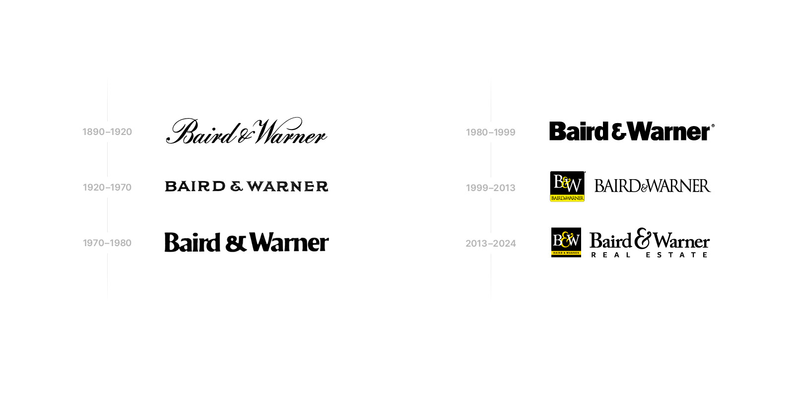
We had had the boxed B&W logo for nearly the first thing we wanted to do was break out of the box — literally and figuratively. We had been using the square boxy logo for decades, and it had limitations. We wanted a logo that felt like an evolution, so we kept the ampersand but went back to our full name instead of the B&W and pulled away the constraints of the box. Now we can incorporate the logo more seamlessly into all types of marketing and design. It also allowed us to represent the full breadth of our service by including the mortgage, Title, Sales, and Insurance in the logo lockup.
What was the intention going into this new brand?
First and foremost, the purpose of this new brand was to support our agents' business. One of the core reasons to go through this rebrand was to get back to the name Baird & Warner in our logo. For more than 20 years, our primary symbol has been the B&W acronym, but we don't go by B&W — we go by Baird & Warner. That's where we have our brand equity, and that's the Baird family name that has stood the test of time. So it was important to bring that back to ensure we're presenting a unified identity and tapping into that brand awareness that exists in the market.

As you mentioned, the Baird & Warner colors for a long time were black and yellow, but that shifted with the rebrand. Can you speak to the inspiration for those new colors and other elements of the brand?
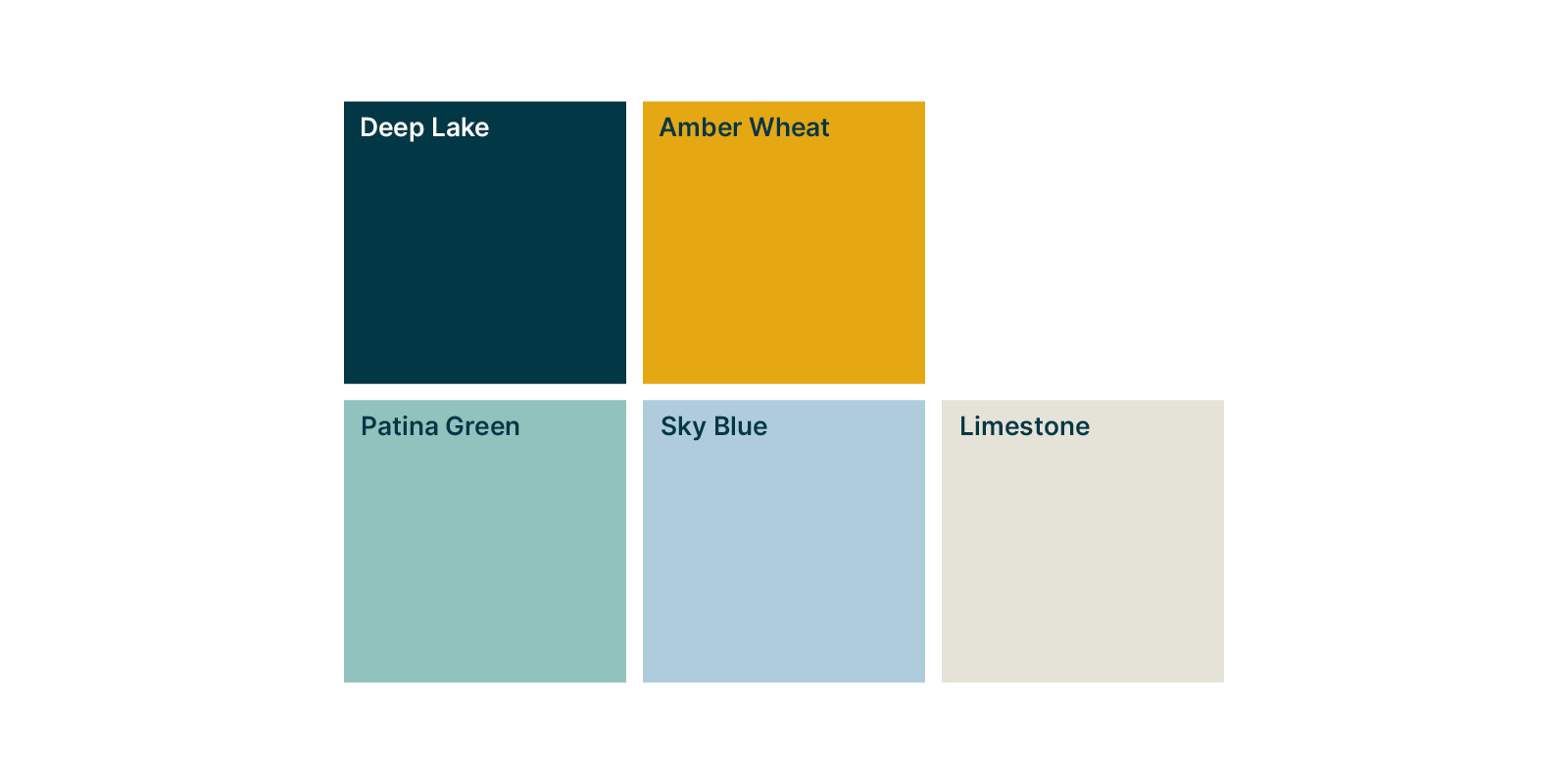
Yes, our new colors are Deep Lake, a slate blue color, and Amber Wheat, which is an evolution of the yellow we had before. The color palette is meant to be emotive and elevated while giving a nod to our legacy as a 170+ year old Chicagoland company. Deep Lake, a reference to Lake Michigan, represents the vast resources we provide to agents — coaching, marketing, training, and all the person-to-person support. Amber Wheat is all about those Midwestern values and our ethics, our resilience as a company.
Along with those colors, we have an expanded secondary palette that gives agents an opportunity to find a balance between the brokerage brand and their own personal branding they may have.
There are some other little hidden references in the brand that speak to our company and history. Can you tell us about those?
Yes, we have an amazing company archive at Baird & Warner, and so we spent the better part of a couple of years digging into our 170 years of history and uncovering a treasure trove of symbols, logos and design elements that we wanted to try and incorporate into the rebrand while still keeping it modern and sophisticated.
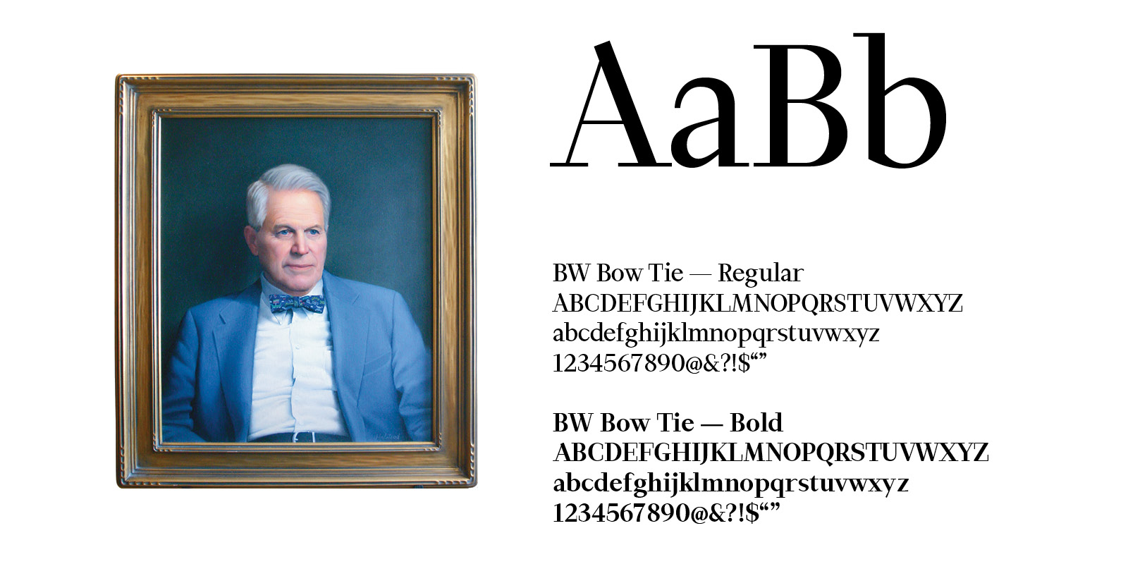
One element is the custom font we called BW Bow Tie, which honors the late John Baird, who was the former president of the company and the father of current CEO Steve Baird. He was very beloved and was a true embodiment of the values we believe in at the company, and we wanted to honor him in some way. The reason we called it Bowtie was because he was known for always wearing a bowtie — it was his signature look.
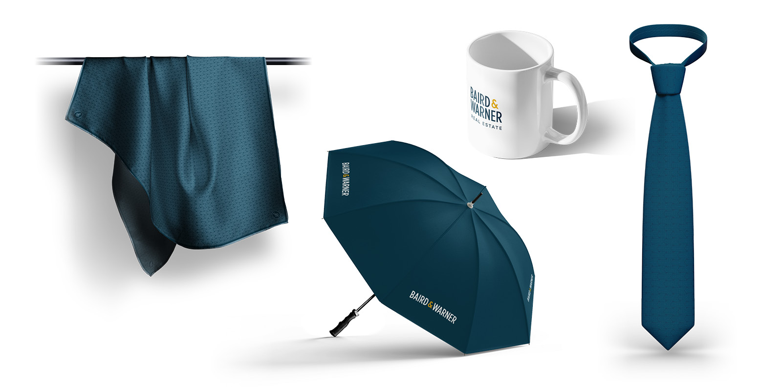
We also created unique patterns and icons that provide a more robust library of design elements that can be used across our marketing and merchandise. The woven Bs and Ws for our name, as well as a refreshed version of an old logo that we call the Baird & Warner Seal, lend themselves to sophisticated wearable items such as a scarf, tie, or pins. 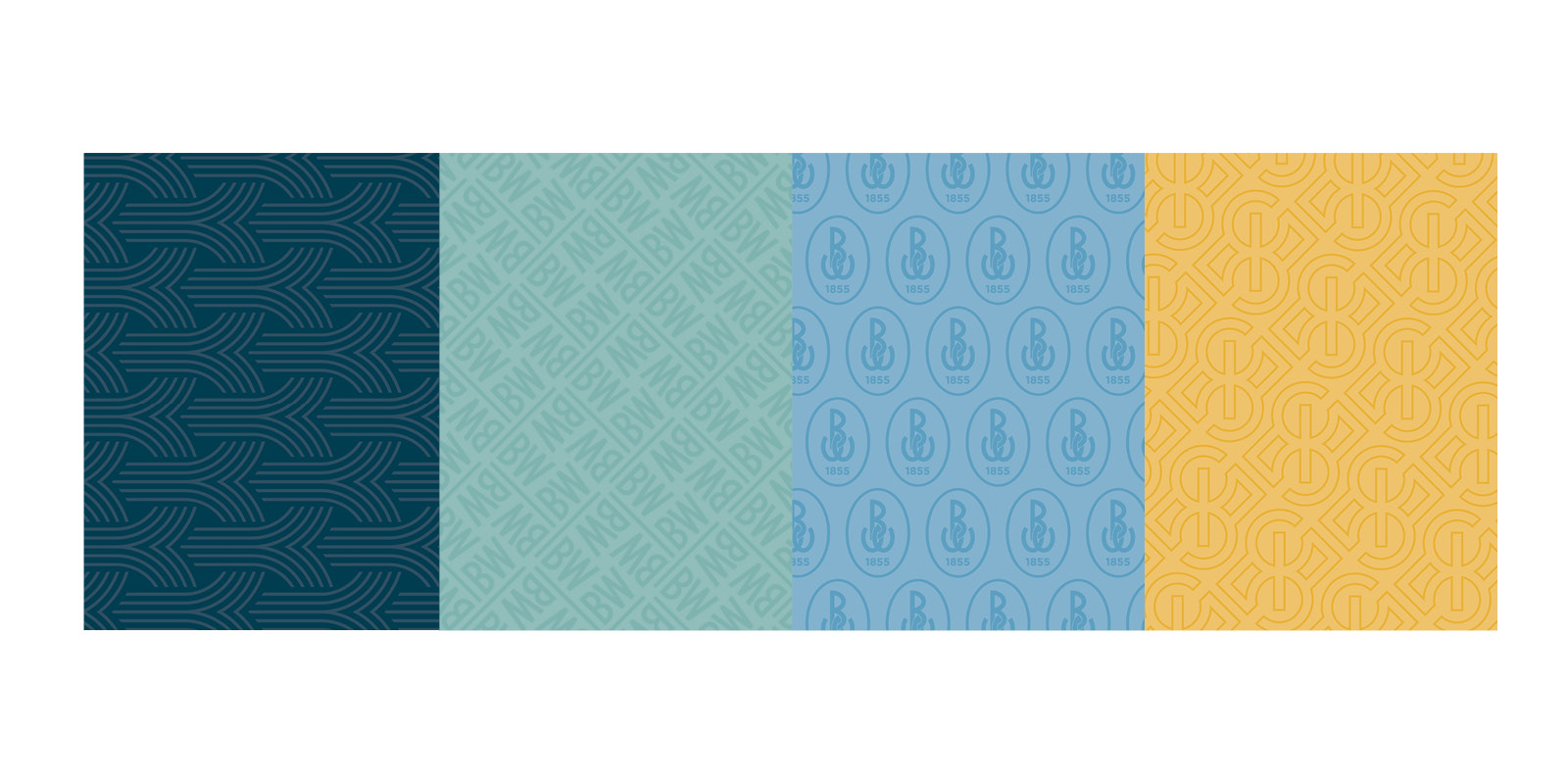
How do you see this brand fitting into the agent's businesses? What has been the response?
This brand should exist as a complement to their own brand. Most of our agents who have a personal brand have embraced the new identity. They feel it reflects their high level of sophistication, service, and expertise. And they also feel it gives their clients an aspirational element in their real estate journey. As mentioned before, they are particularly fond of the new color palette and the patterns we've introduced, as they provide an elevated, luxury element to the brand.
As with any complete rebrand, there is always a risk of missing the mark. Thankfully, our agents have overwhelmingly adopted the new logo and its elements. And more importantly, reported several success stories where it helped them stand out.
Visit joinbw.com to learn more about how we help our agents succeed.
16
Chicagoland's Best Waterfront Spots to Enjoy This Summer
Overlooking the shoreline of Lake Michigan, Chicago features one of America's great urban waterfronts. And with summer on the way, this is the perfect time to get outside and enjoy it. These are some of our real estate agents' favorite waterfront spots in Chicagoland.
- Lakefront Trail - 900 W Ardmore Ave, Chicago, IL 60660
One of Chicago's best destinations for jogging, cycling, dog walking, and simply enjoying the view, the Lakefront Trail stretches 18.5 miles along the city's shoreline. The trail connects multiple neighborhoods and links more than a dozen lakeside park...
9
A Guide to Chicago's Iconic Architectural Tours
In Chicago, history is never hidden from view. It's all around in the Art Deco buildings, Chicago School skyscrapers, residential greystones, and bungalows in neighborhoods all over the city. Architecture provides a window into Chicago's past, and our real estate agents are excited to share some of the best architecture tours in Chicagoland.
AWARD WINNING SERVICES

GLOBAL REACH & HOME INSURANCE

WEBSITE AWARDS


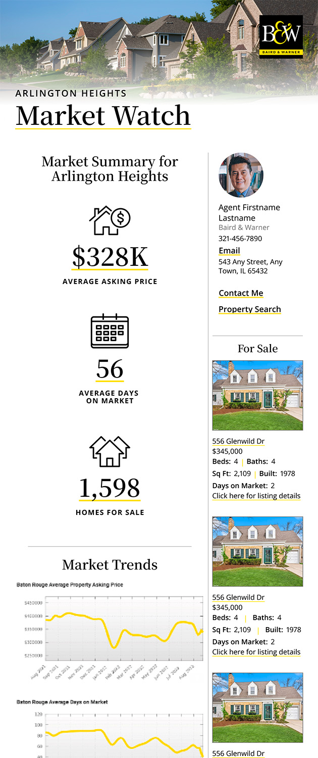
Market Report
Sign up today to stay updated on what’s happening in your local real estate market.